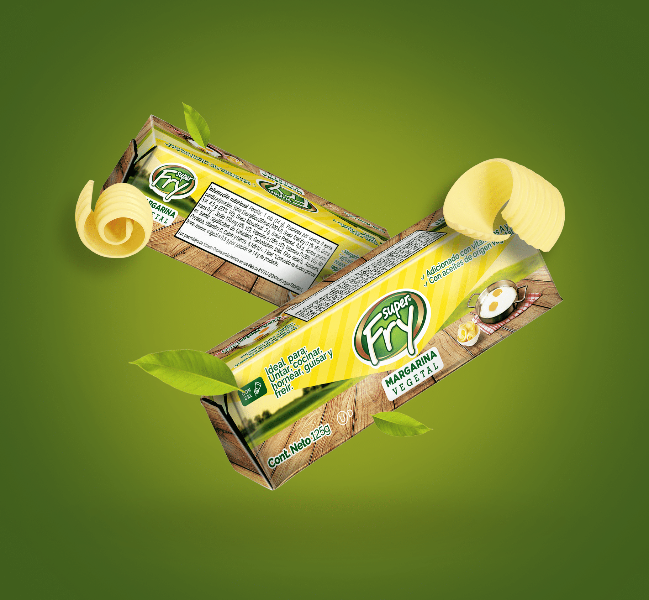
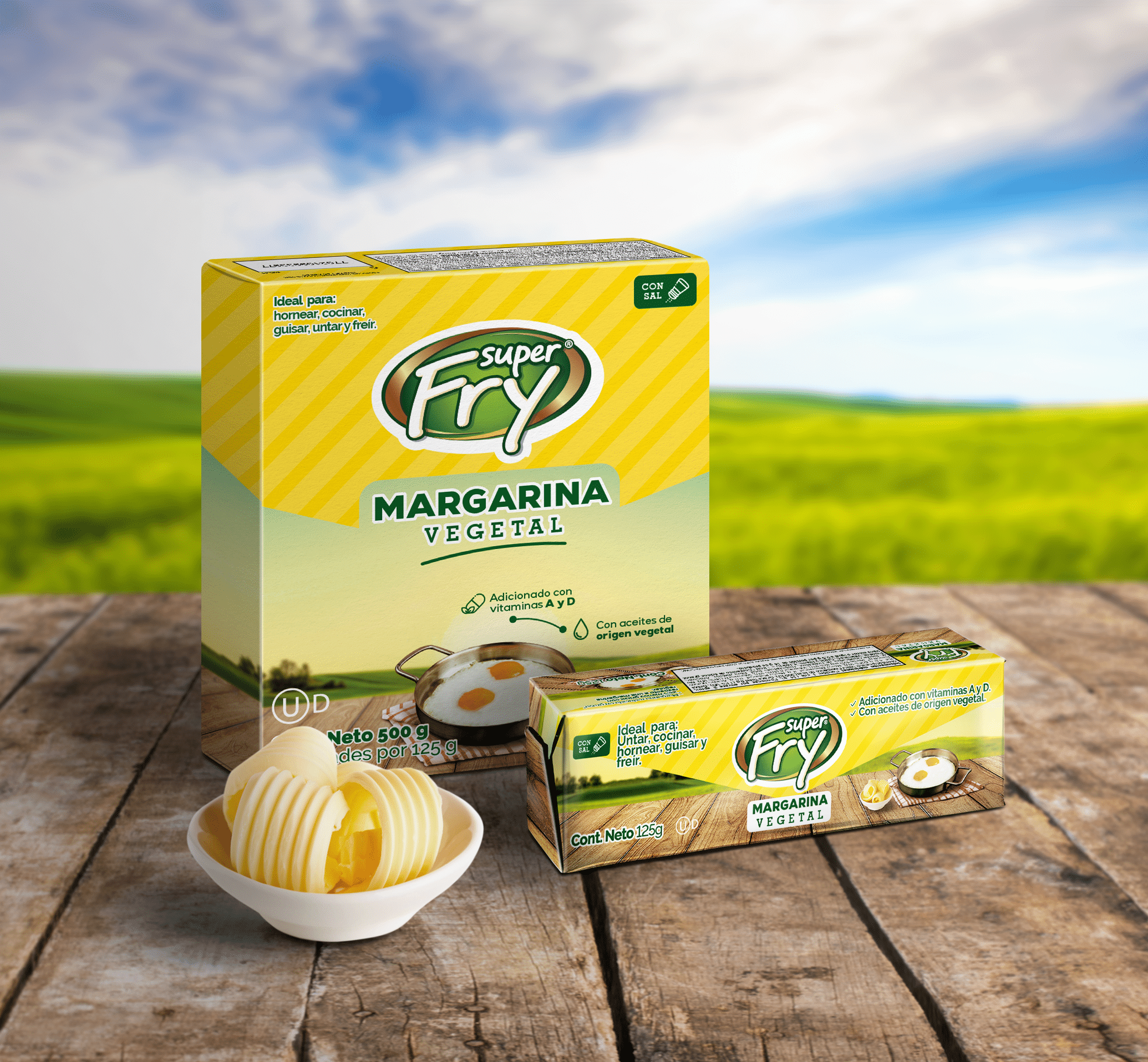
Super Fry is an Alianza Team brand for home and industrial use. We designed the Super Fry labels for its different pack sizes.
The challenge behind the Super Fry labels
Create attractive, functional labels that convey the product’s quality. In addition, each pack size had to be easy to identify at the point of sale.
What we did for the Super Fry labels
We designed a label system that keeps the brand identity consistent across all sizes. In other words, the container changes format, but the brand is just as easy to recognise on each one.
We also added visual elements that highlight the product’s benefits. Then we organised the information with a clear hierarchy. As a result, shoppers see the brand first, then the product and finally the details they need.
This order matters when one brand shares the shelf with several pack sizes. Without a system, each label is designed on its own and the range loses impact. With shared rules, however, each new size joins the family without breaking the brand image.
How we design labels
Discovery: first, we review the brand, the containers and where the product is displayed.
System: then we define a shared structure that adapts to each container size.
Design: next, we develop each label with a clear hierarchy of brand, product and information.
Artwork: finally, we prepare print-ready files to each container’s measurements.
The result
A cohesive set of labels that strengthens the brand at the point of sale and gives shoppers clear, appealing information. After all, the label is the visible face of packaging. For this reason, a well-resolved system makes every pack size look like part of one family.
We produced “Sushi de Película”, the commercial Cine Colombia screened in its cinemas to present its sushi offer. The challenge behind the Sushi de Película...
For Alianza Team we created the Dagusto launch video, presenting its new cream base for industrial pastry. The challenge behind the Dagusto launch video The...