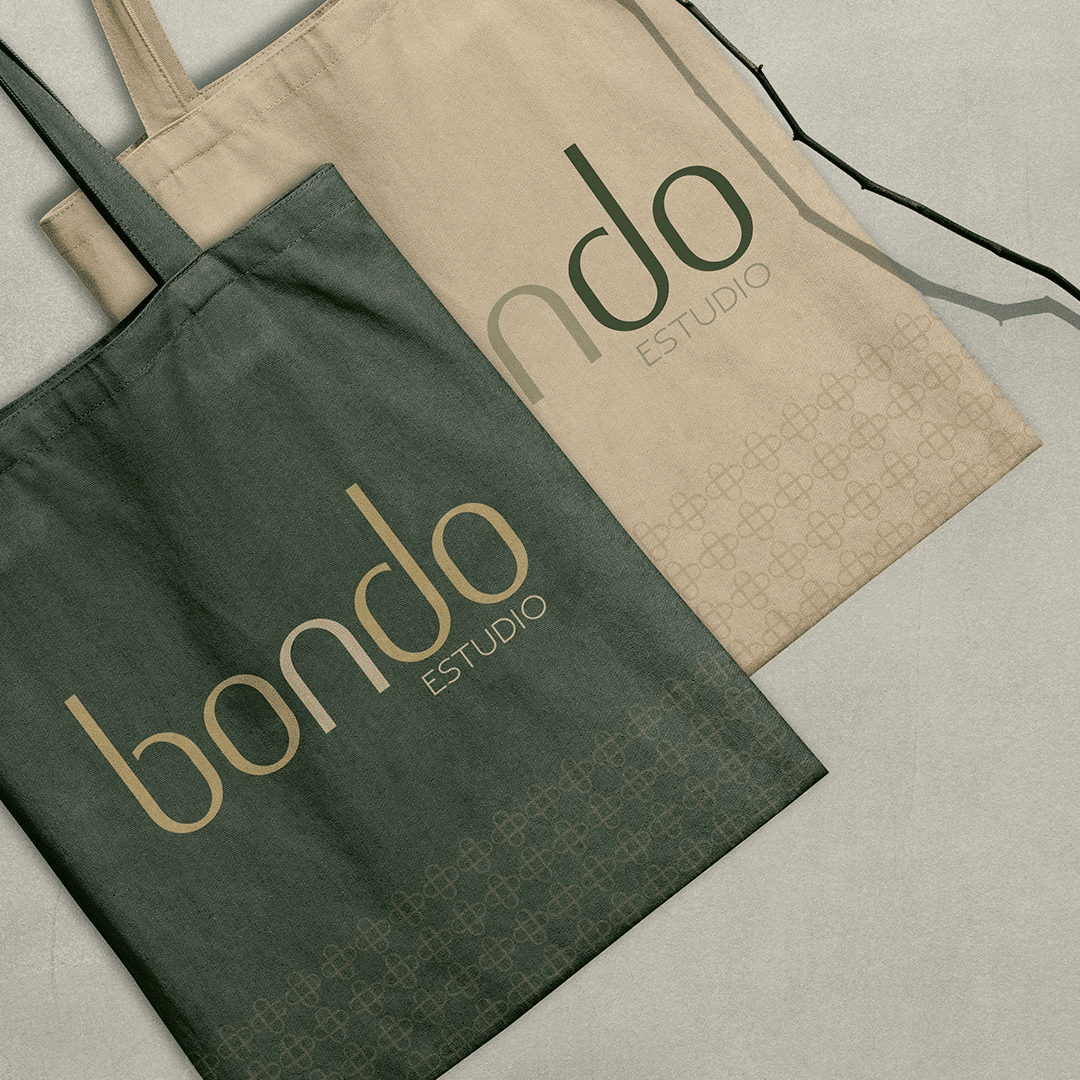
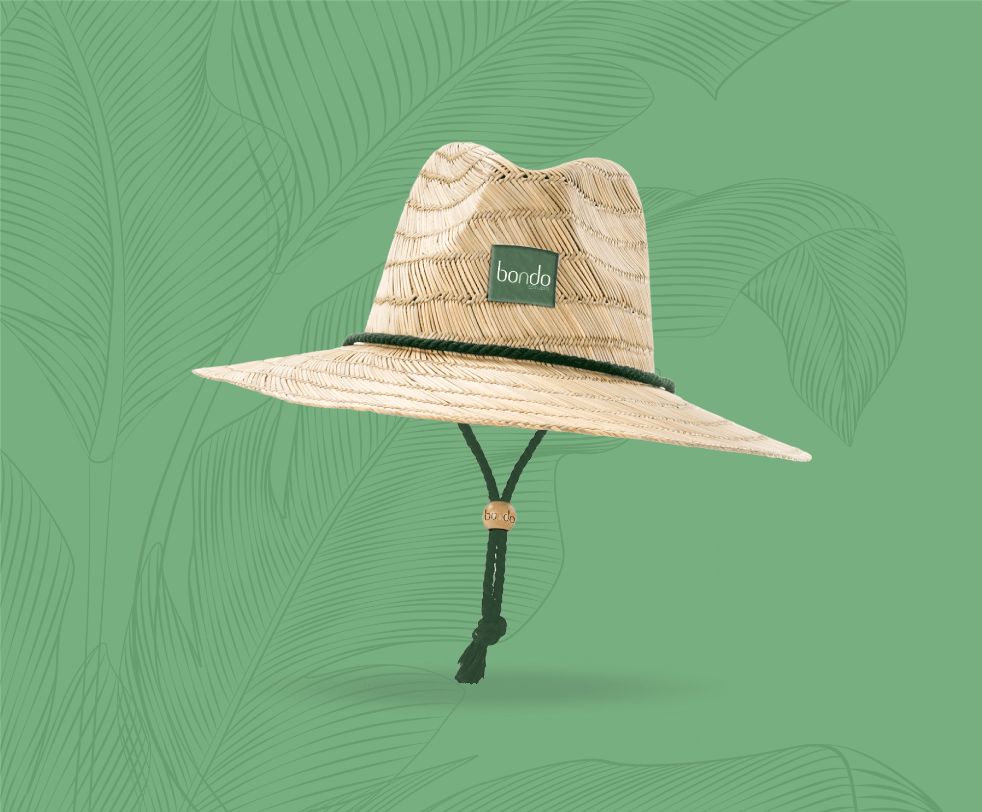
We created the Bondo Cartagena brand from scratch for a hometel in the Colombian city.
The challenge behind the Bondo Cartagena brand
The hometel needed an authentic brand, connected to the city’s coastal setting, that blended tradition and modernity. It also had to be delivered quickly.
What we did for the Bondo Cartagena brand
First, we started from the local architecture and its latticework, one of the city’s most recognisable features. From there, we designed a modular, cohesive typeface that reflects the essence of the project.
Then we built the colour palette from the region’s characteristic tones, to bring in its cultural identity. As a result, the brand goes beyond a logo: it takes its visual language from the place where it stands. The whole process took just three weeks.
In addition, in hospitality a brand stays with guests before, during and after their stay. For this reason, a clear sense of place matters from the very first contact. For Bondo, that sense of place comes from the city’s architecture and colour. That is what makes the identity feel local rather than generic.
How we build a brand identity
Immersion: we get to know the business, its audience and its surroundings, and review its context and competitors.
Concept: we define the central idea that will guide every design decision.
Design: we develop the logo, typography, colour palette and graphic elements as one system.
Applications: we roll the identity out to the pieces the brand needs and hand over the rules for using it well.
The result
An authentic brand identity, connected to its surroundings and delivered in just three weeks. Thanks to the latticework and the regional palette, Bondo has a visual language rooted in Cartagena.
Running a hotel or hospitality project that needs a brand with a sense of place? See our branding services or take a look at the LUM brand identity.
Project gallery
Related projects
Media
Sushi de Película
We produced “Sushi de Película”, the commercial Cine Colombia screened in its cinemas to present its sushi offer. The challenge behind the Sushi de Película...
For Alianza Team we created the Dagusto launch video, presenting its new cream base for industrial pastry. The challenge behind the Dagusto launch video The...