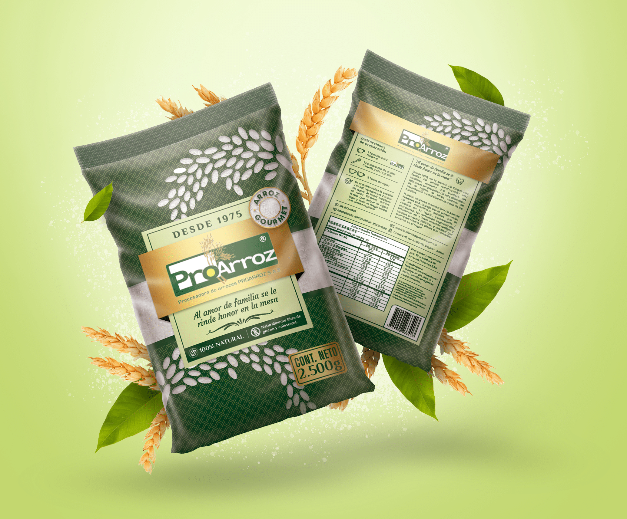
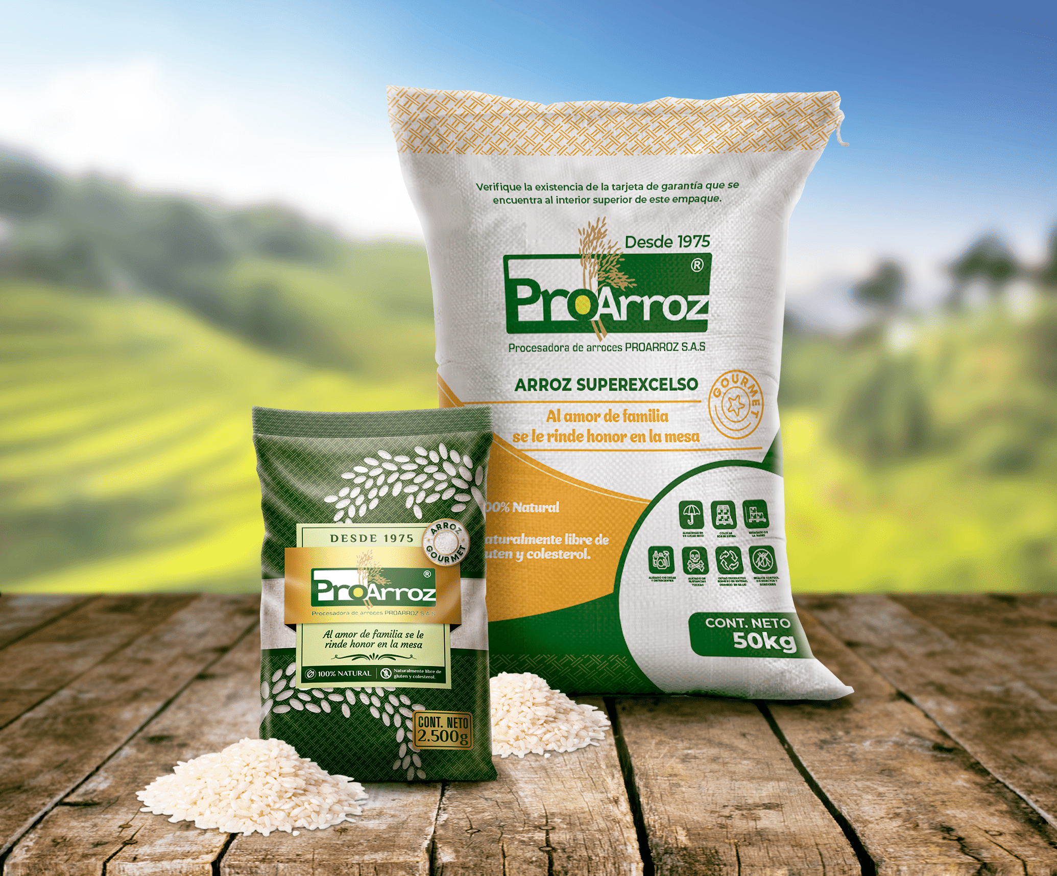
Proarroz grows rice in the Ibagué region of Colombia. It asked us to redesign the Proarroz packaging with a focus on the story and tradition behind its rice.
The challenge behind the Proarroz packaging
Show the product’s origin and quality on the pack. In addition, connect with the Colombian families who bring it to their table.
What we did for the Proarroz packaging
One line guided the whole concept: “Family love is honoured at the table.” It sums up the idea that rice is something families share at home. From there, every design decision speaks of family, origin and tradition.
To do this, we used traditional, natural visual elements. They reflect the product’s authenticity and its connection to the land. We also combined warmth and modernity, so the pack feels current without losing its roots.
For an everyday food, telling the story of its origin is a clear way to set the brand apart. As a result, the pack does more than inform: it also shows where the rice comes from and the values behind it.
How we redesign packaging
Discovery: first, we review the current pack, the brand and the elements worth keeping.
Concept: then we define the central idea that guides the design and the message it must convey.
Design: next, we develop the packaging family with a clear hierarchy of brand, product and information.
Artwork: finally, we prepare production-ready files and support the technical adjustments.
The result
A packaging family that reinforces the quality and origin of a staple of Colombian cooking. Also, the message is centred on family, the value that guided the concept from the start. In this way, the pack links the rice to its region, Ibagué, and to the table of the people who buy it.
We designed the Strike Four corporate presentation, the digital document this investment fund, which specialises in financial derivatives, uses to present its offer to investors....
We designed the Constructonik brochure, the printed piece this Miami builder uses to present its homes, its models and its patented construction system. The challenge...
We designed the Arc Windward book, a printed piece that presents the Arc penthouse, the beachfront residential project Windward is developing in Long Bay, Turks...