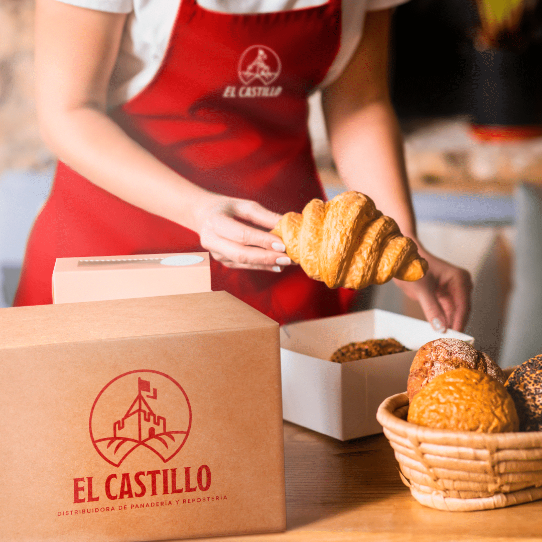
With the El Castillo rebrand we updated a brand with heritage: we redesigned its logo and created its brand guidelines.
The challenge behind the El Castillo rebrand
Revitalise the brand while respecting its heritage and projecting it into the future. In other words, change what was needed without losing what makes it recognisable.
What we did for the El Castillo rebrand
First, we redesigned the logo to reflect modernity and sophistication. The aim was a logo that looks current without breaking with the history of the brand.
Then we created brand guidelines setting out how to apply the brand correctly across every touchpoint. Guidelines like these usually cover logo use, colours, typography and examples of application. As a result, anyone on the team or any supplier can use the brand consistently.
This step is key in any rebrand. A new logo is not enough if every piece applies it in a different way. For this reason, the guidelines protect the investment in the new identity.
How we approach a rebrand
Discovery: first, we review the current brand, its history and what people already recognise in it.
Strategy: then we define what stays, what changes and where the brand should be heading.
Design: next, we redesign the logo and identity elements, testing them at different sizes and on different media.
Brand guidelines: finally, we document the rules of use so the brand is applied the same way at every touchpoint.
The result
A cohesive, appealing brand identity that strengthens El Castillo’s presence and builds a closer connection with its customers. In addition, the guidelines give the brand a solid base to grow in an organised way. In short, the rebrand modernised the logo without losing the heritage behind it.
Does your established brand need updating without losing what makes it recognisable? See our branding services or take a look at the LUM brand identity.
Project gallery
Related projects
Editorial
Strike Four Corporate Presentation
We designed the Strike Four corporate presentation, the digital document this investment fund, which specialises in financial derivatives, uses to present its offer to investors....
We designed the Constructonik brochure, the printed piece this Miami builder uses to present its homes, its models and its patented construction system. The challenge...
We designed the Arc Windward book, a printed piece that presents the Arc penthouse, the beachfront residential project Windward is developing in Long Bay, Turks...